About the Author: Lilly Nguyen is a PhD candidate in the Department of Information Studies at UCLA. Her research interests explore cultural dynamics of knowledge circulation in postcolonial contexts. She is especially interested in the moral economies of software and methodological questions of data representation and its narratives. She is currently writing her dissertation on the modes of hybridity that emerge through the encounter between free and open source software and pirated software in Vietnam. She previously received her bachelor’s degree in Political Economy from UC Berkeley and her master’s degree in Media and Communications from the London School of Economics and Political Science.
I. Introduction
The overarching goal for this visualization research paper was to make recommendations for future visualization strategies. Based on conversations with RoSE colleagues, colleagues at UCLA, and others in the digital media research community, this report provides an overview of three types of visualization strategies: network mapping, poetics and composite portraitures, and tagging. While these three are neither mutually exclusive nor exhaustive approaches to visualization, they collectively represent a range of approaches that are feasible to implement. Additionally, these three may cohere into a kind of visualization ecology and initiate discussion for future strategies and prioritization for visualization development.
In this report, I provide an overview of the methodology, approach, and motivation for this report. The subsequent sections then describe the three visualization approaches–network analysis, poetics and composites, and tagging–with examples and a brief discussion of the implications for implementation. In the subsequent section, I provide a summary of the recommendations for future work which are: (1) an emphasis on poetic approaches to encourage epistemological discussions of knowledge subjectivity and interpretation; (2) an ecological approach facilitating multiple visualizations that are then tied to specific goals; (3) the use of tag clouds to balance diagrammatic and poetic visualizations; and (4) an overall user-centered approach to designing visualizations to address specific research questions that RoSE colleagues may have.
II. Methodology
The goals for this visualization research are two-fold. The first goal is to understand the implicit assumptions, problems, ideas, and ideals that RoSE researchers have about concepts of visualization. Visualizations are not intrinsic objects but are designed with certain kinds of values, intentions, and performative abilities. Keeping this in mind, I wanted to get a basic understanding of how RoSE reseachers have so far been defining concepts of visualization, explicitly and implicitly. Answering this question thus entailed a kind of “mini-ethnography” whereby I spoke with several RoSE researchers and asked them about what kinds of visualizations they liked or did not like, and what kinds of visualizations they thought would be appropriate for the available data. The second goal was then to survey extant visualizations to identify appropriate models for implementation in RoSE. This required a review of the current literature on visualization as well as extensive scanning of the landscape to find examples to share with the RoSE group.
For the first part of the research, I spoke with several members of the RoSE team over the course of two weeks, including Chris Hagenah, Eric Chuk, Charlotte Becker, Renee Hudson, the several members of the RoSE visualization team–Ivana Andjelkovic, Salman Bakht, Rama Hoetzlein–and Johanna Drucker. These conversations typically lasted anywhere from half an hour to one hour. For the second part of my research, I sent an email to the Institute for Distributed Culture asking for examples and literature. I also exchanged emails with faculty and students from the Design and Media Arts Department at UCLA including Mark Hansen and Christo Allegra. These individuals may be good future colleagues for the RoSE project. I also culled examples and visualization resources from our own Transliteracies email group.
III. Finding New Relationships and Network Analysis
NETWORK ANALYSIS
One of the broader goals of RoSE is to create a system in which researchers can find new relationships among disparate media objects. Many of the network diagrams that we currently have address this goal by showing relationships in time as well as affinities based on social roles (e.g. advisor, classmate, etc). These kinds of network analyses build on a long tradition of social network analysis, a long standing methodology in sociology for analyzing relationships across large groups of people.1 This network approach to social relationships has been recently popularized by Alfredo Barabasi2 and provides a language to think of relationships in terms of nodes, flows, and directions. This approach provides a kind of top level view, identifyng connectivity across disparate objects. However, this approach is limited in its ability to qualitatively explain the nature of the relationships across different nodes.
Bibliometrics is a form network analysis that looks specifically at forms of citation. This is a very common methodology in library and information studies to look at the impact and centrality of certain types of journals and scholarly fields. Bibliometrics is defined as
“...a set of methods used to study or measure texts and information. Citation analysis and content analysis are commonly used bibliometric methods. Central variables in bibliometric evaluations are publications, authors, source materials and citations. You can examine how research is in a certain country, research area or research group. Researchers may use bibliometric methods of evaluation to determine the influence of a single writer, for example, or to describe the relationship between two or more writers or works.”3
Mapping is a key component to this line of analysis and Loet Leydesdorff’s mapping technique is one example of this. In the image below, he has put together a map of the “citation environments” in which is depicted the co-citation occurrences. The image below is the citation environment for the journal Research Policy (RP). In this table we can see that there are 19 other journals that are cited in relation to RP. Most of the journals are only one degree away from RP. It is unclear whether the weight of the lines indiciate reciprocal/singular citations, or amount of citations. That is, the relationship being indicated through the lines across nodes is inclear.
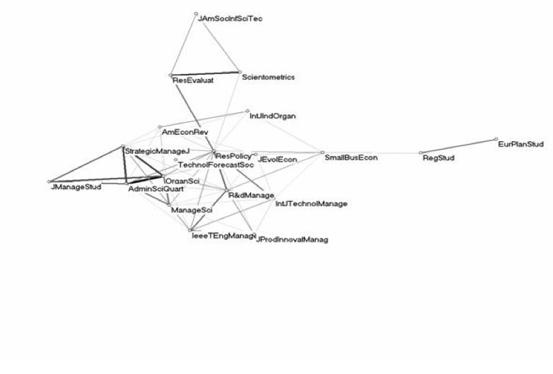
Image 1: Leydesdorff’s Citation Environment
As stated earlier, these network techniques have become quite pervasive. A quick scan of websites like Information Aesthetics4 or Visual Complexity5 quickly demonstrate this. One particular visualization site, “They Rule”6, is especially compelling in its ability to reveal new kinds of relationships. The goal of They Rule is to reveal the relations across the corporate and public sectors by specifically looking at individuals who sit on multiple boards across these domains. Individual users create these maps and publish them in They Rule. The website describes itself as “a website that lets users build maps of the interlocking directories of the most powerful companies in the US.” One particular map called “The Magnificent 7” provides us with an example image.
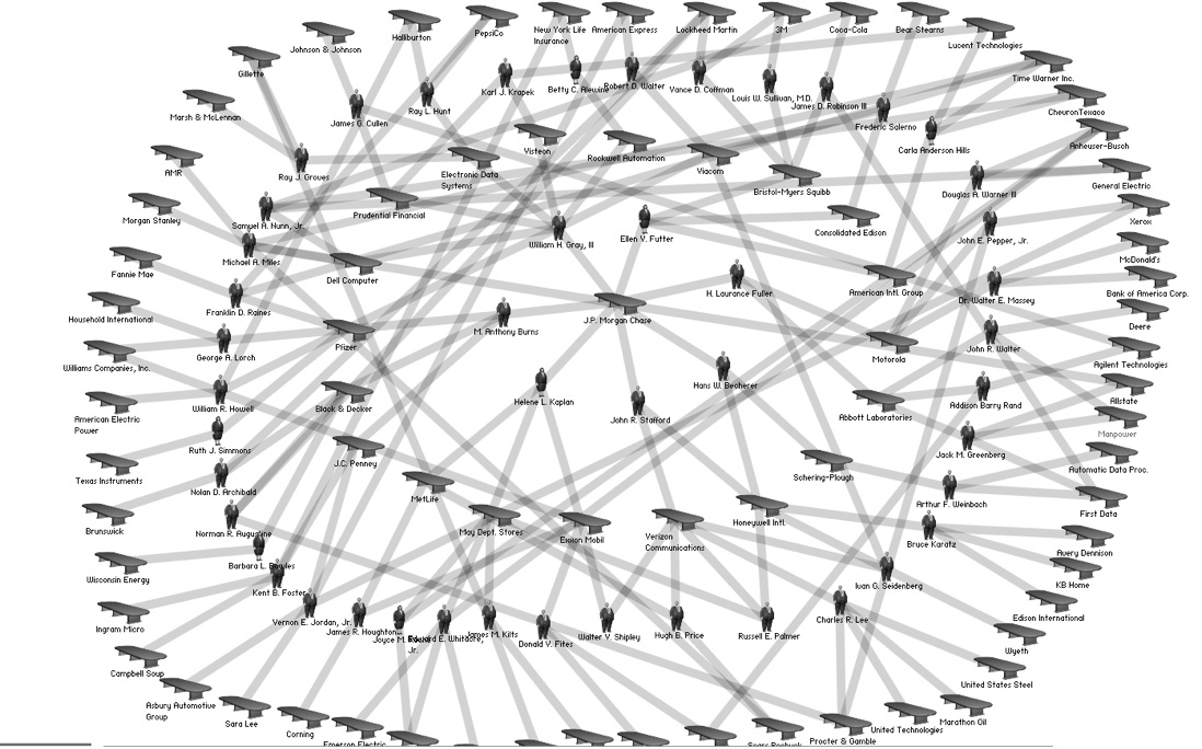
Image 2: “The Magnificent 7 from They Rule
If we look closely, we can see that Anthony Burns sits on the Board of Directors for JP Morgan Chase, which puts him in relation to the other 6 individuals in the inner circle of the diagram. He is also on the Board of Directors of JC Penny and two other companies, etc. From this table we can then see the ways in which various companies are related to one another, by how many degrees, etc. One especially compelling feature of They Rule allows us to find connections that may not be immediately known.
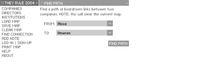
Image 3: Find Connection function in They Rule
In the image above, I have selected “Alcoa” and “Ameren” as two example companies and this search resulted in the following image.
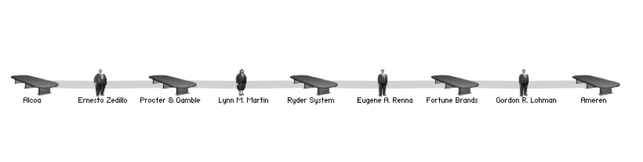
Image 4: Example Find Connection visualization
The strengths in They Rule entail the ability to discover new relationships across a wide set of data. People are allowed to upload their own network diagrams which offloads a lot of the work of updating and refreshing the information. The use of icons is also a powerful tool to convey information and embodies a certain kind of elegance that makes it easy to understand. I especially like the limited use of color. In this, case it lends itself well to the types of data it communicates. The use of broad lines also makes the diagrams easier to comprehend.
IMPLICATIONS FOR IMPLEMENTATION
The examples provided above are based on data types that do not mirror what we currently have in RoSE. Bibliometric and citation data are heavily standardized, based on common standards across journals which make comparison and analysis much easier. Journals also list bibliographies and reference lists as separate files and so the amount of work required to “massage” the data into comparable forms is not overly burdensome. This is certainly not the case for RoSE. However, we may want to consider other resources that may have the data we need and consider importing data rather than manually entering data. We may also consider creating processes of user-generated data, as in the case of They Rule. Currently in RoSE, the researchers are those who add data, organize, classify, and scrub all the data. This is not a sustainable practice given the large amounts of time and work required to do so. Perhaps RoSE can take this user-generated model and open itself to a wider community of users for data input. In terms of process, this may improve the speed by which data is refreshed and added to the system. However, this opens us to the potential problem of quality control, with increasing problems of “erroneous” data. However the concept of data error may be highly subjective in RoSE; that is, what would constitute bad data is up to us, as designers of the system, to define.
Poetics and Composites
POETIC APPROACH TO VISUALIZATION
In contrast to network based approaches are poetic approaches to visualization. These poetic approaches can be loosely defined as more artistic ideas of representing information. In this manner, visualizations are not intended to convey discrete information, but can be described as more artistic and expressive. Both approaches communicate ideas to people, however they maintain different performative effects with respect to the different roles of the audience, reader, user, etc. More poetic visualizations, I would argue, invite the audience/reader to make their own conclusions and understandings of the data, thus underscoring notions of interpretation and subjectivity. I believe that it is important to be reflexive about the kinds of knowledge we encourage through the actual design of the system, in the metadata, in the visualizations, etc. Thus, I believe that concepts of interpretation and knowledge subjectivity are values we should promote in the system and concepts of poetics may help us to this end. The concept of poetic visualization has been previously defined in opposition to concepts of functional and diagrammatic visualization.7 Lau and de Moere suggest a spectrum between these two poles that may guide our thinking, strategizing, and prioritizing of RoSE visualization endeavors.
EXAMPLES OF COMPOSITE BASED VISUALIZATION
A specific approach to realize poetic visualizations is compositing. One example of compositing is Jason Salovon’s project, “Every Playboy Centerfold, The Decades.”8
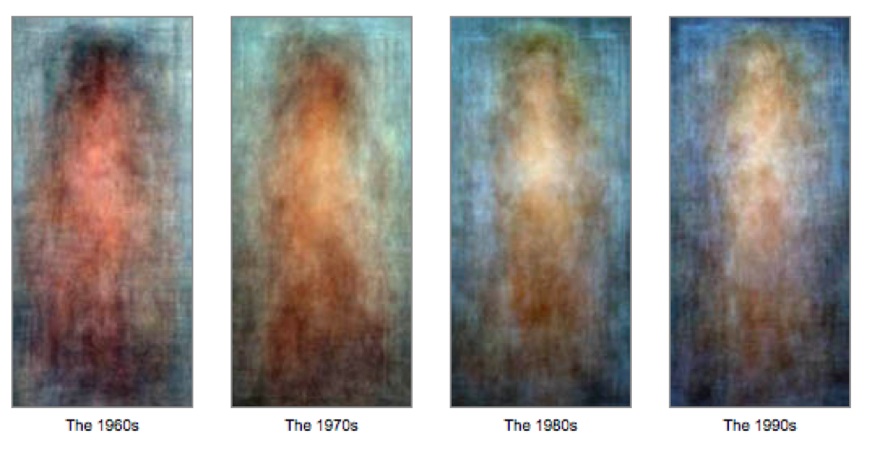
Image 5: Salovon’s Example of the compositing technique
The artist describes these images in the following way:
“...the photographs in this suite are the result of mean averaging every Playboy centerfold foldout for the four decades beginning Jan. 1960 through Dec. 1999. This tracks, en masse, the evolution of this form of portraiture.”
The compositing technique is computational and would suggest more functional and diagrammatic representations, however, the longstanding emphasis on portraiture in this kind of image compositing lends itself to more poetic forms of visualization9. These ideas of compositing are based on statistical concepts of averages, means, etc; that is, the images above indicate some kind of “average” Playboy centerfold body type in that period of time. Generally speaking, the technique of image compositing typically entails laying several photos on top of one another. The end effect is the blurring away of difference and common traits brought to the forefront. To see this more clearly, below is an example of early composite imaging. In the example below, what we see is the “average” scientific man of 1885.
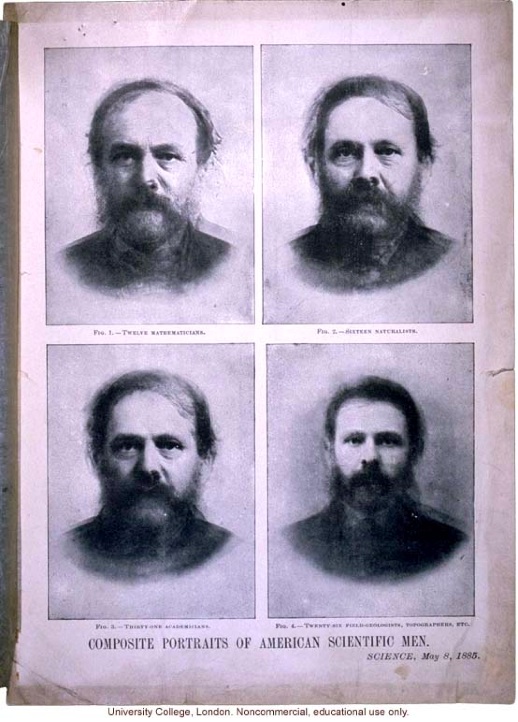
Image 6: Examples of composite portraitures of “American Scientific Men” 10
The examples of composite imaging and portraiture, however, do not lend themselves directly to the types of data we currently have in RoSE, which is primarily text-based. The following example of TwitFlick11 brings concepts of averaging and compositing to text data. TwitFlick is a visualizaton application that pulls from two different sources, the microblogging site Twitter and the photo sharing site Flickr. The images you see below are live feeds from current Twitter feeds which then trigger a search for Flickr images that correspond to the Tweets. The original intent of this project was to “curate” data scenes in such a manner as to present images that revealed something about the pulse of digital conversations at that specific moment. On the website, these images slowly emerge, the original Tweet is then presented towards the end and then dissipates into the next image/scene.
The technique of compositing and averaging was thus applied primarily to the text and not the images in this project and was loosely defined. We undertook language processing techniques (searching in bigrams in this case, using python scripts to cull text and images) to identify salient Tweets (also making sure to eliminate Tweets that included too much short-hand (e.g. OMG, LOL, etc), and spelling errors. Iterating RoSE member Salman Bakht’s statements about “two-way streets” during our RoSE email conversations, this process was iterative and consisted of a lot of trial and error to identify compelling images, scenes, and ultimately visual narratives.
Images 7 and 8: TwitFlick (Alberto Pepe, Mark Hansen, Sasank Redy, and Lilly Nguyen)
IMPLICATIONS FOR IMPLEMENTATION
The concept of compositing may be helpful as one strategy to create more poetic visualizations. There are certainly an infinite number of ways to conceptualize and define poetics for RoSE purposes, however the compositing techniques and examples provided above should at least provide some sense of what the power of poetics as an alternative to network mapping techniques can offer. The implementation of poetic approaches will certainly be a challenge. The use of image based data in the first example is not immediately applicable to RoSE since RoSE data consists of text-based data. Moreover, the second example, while being text-based, is based on continuously updated data. Currently RoSE does not have this capability, but this is possibly something we could design into the RoSE workflow should this be a direction we want to take.
Tag Clouds and Data Pivoting
Tag clouds represent another possibility for visualization. Given our current use of non-hierarchical keywords, or tags, this should be easily implementable at a superficial level. Image 9 below is a tag cloud I was able to immediately generate based on the keywords within the RoSE System. This kind of tag cloud could also easily be generated with the existing metadata fields. The visualizations in this example however are not explicitly stitched to the data in a manner that allows for searchability, a characteristic of tag clouds that is very powerful for the discovery of new information and resources.
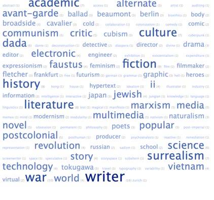
Image 9: Tag cloud based on RoSE keywords12
One implementation of tagging and tag clouds is del.icio.us, the social bookmarking site. I this case, tag clouds are combined with additional features like personal profiles that allow one to “pivot” across data. From these kinds of pivoting, one is able to find new data that relates specifically to one’s personal interests. For example, below is my personal tag cloud, generated from my del.icio.us account. This cloud represents the keywords that I have attributed to the items in my del.icio.us collection.
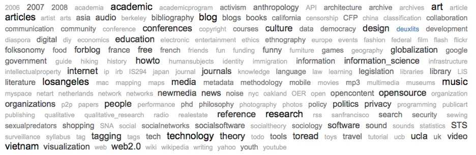
Image 10: My personal del.icio.us tag cloud
If I click on the tag “losangeles,” I see a list of all content that I have tagged with the term. In the right hand corner is a number that tells me how many other people have tagged that specific content. If I then click on that number I can see who else has that particular item in their personal collection and I can also view what other terms they have used to label that particular digital object, as well as the various annotations and memos people have written about the object.
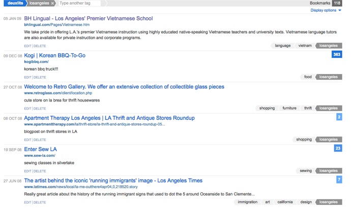
Image 11: List of content labeled “losangeles”
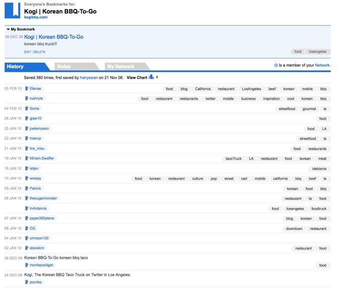
Image 12: List of individuals who have same tag terms and objects
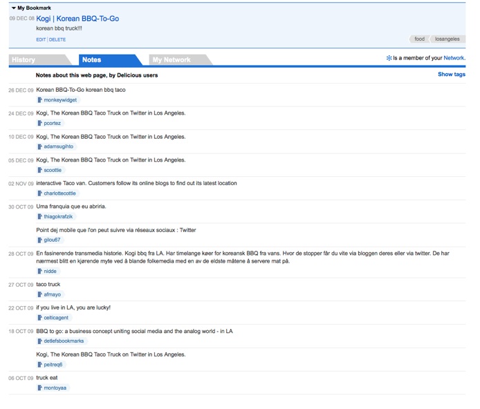
Image 13: List of annotations for shared object
IMPLICATIONS FOR IMPLEMENTATION
Del.icio.us was one of the first sites to initially implement tag clouds. More recently they have really revamped the display of their data and leveraged the use of tags, URLs, and personal networks to create visualizations that show relationships dynamically and not only for top level views, but they also allow people to drill down and find new types of data. These types of tag-based sites function in such a manner as to allow discovery of new content by employing notions of “crowdsourcing.” This crowdsourcing approach resonates with previously mentioned ideas of user-contributed data in section IV and would thus require a redesign of the RoSE workflow.
VI. Tentative Recommendations Based on Introduced Examples
Based on a scan of examples, extant literature, as well as conversations with other RoSE colleagues, I will make several recommendations on future strategies for visualization. First, I believe that a turn to more poetic approaches may seem to be jumping ahead of the curve. I am particularly motivated in this regard because concepts of poetics provide a language to work through discourses of knowledge that appear to be missing in the extant verbiage on RoSE. I can well understand why we may want to forestall these epistemological discussions as they might prevent us from implementing them. However, I at least hope to raise notice to this question and if we choose as a group to table it, we do so with intent, not because we simply forgot.
Second, I believe that we should consider visualizations in terms of ecologies. Network maps, tag clouds, and composite portraiture are neither mutually exclusive nor exhaustive. There is a wealth of visualization models that have only been flirted with in this report. That said, I believe that we should take Lau and de Moere and push the metaphor of spectrum further. The notion of ecology may help us frame visualizations in relationship to one another. From this perspective, we can argue that certain templates for visualizing information allow us to understanding certain types of things, while other visualization templates perhaps allow a different kind of analysis and interpretation. For example, temporal based visualizations may not always work with all RoSE content. We can thus keep in mind that timelines provide certain types of intellectual affordances, in contrast to topographical or geographically based ones, for example.
Third, the use of tagged data and tag clouds can be both diagrammatic and poetic. We could begin to consider typographical and design elements to create both types of visualizations. I believe that these forms of visualization may be the easiest to immediately implement.
Fourth, the design of visualization needs to be iterative and user-oriented. In this first design round, the users of the system include all of us working on the project. Perhaps the next visualizations can start with concrete research questions, or things we would like to know. Charlotte Becker articulated a wonderful question during our conversation about wanting to see the geographical distribution of publishers from the ballads’ data which seems like a very viable and compelling project to test RoSE and explore other types of useful visualizations. These kinds of questions should be solicited from the three research groups as we begin to play more with different types of visualization. Building on this user-centered approach, I believe there needs to be more explicit discussions about the specific actions, behaviors, and interactions that RoSE intends to create. While knowledge discovery is the overarching goal, I believe that the visualizations may benefit from a more user-centered and design-centered approach in which information flows and interactions are more clearly articulated.
Notes
- 1Here is a list to a WorldCat search on the topic: http://www.worldcat.org/search?qt=worldcat_org_all&q=%22social+network+analysis%22
2Linked: The New Science of Networks (2002)
3From Lulea University of Technology website: http://www.ltu.se/lib/faculty-support/Pure/bibliometrics/1.49322?l=en-->li>
4http://www.infosthetics.com/
5http://www.visualcomplexity.com/vc/
sup>6http://www.theyrule.net/2004/tr2.php
7Andrea Lau and Andrew Van de Moere, “Towards a Model of Information Aesthetics in Information Visualization,” Proceedings of the 11th International Conference Information Visualization, 4-6 July 2007: 87-92.
8http://salavon.com/PlayboyDecades/PlayboyDecades.shtml
9To learn more about the fascinating history of image compositing please see the work on Francis Galton at http://galton.org/
10Image obtained from the Eugenics Archive, http://www.eugenicsarchive.org/html/eugenics/index2.html?tag=2216
11The running visualization is available at http://208.109.180.7/webbyawards/twitflick.html
12Generated using automatic tag cloud generator, TagCrowd, http://tagcrowd.com